Comms. Connected: Brand identity
Goal
Create a visual identity that communicates connection, collaboration, and clarity while giving a new organization a distinctive and memorable presence.
Communications Connected is a business that enhances communication between healthcare providers and patients. They provide healthcare communication skills training, accent modification, public speaking training, and more.
The owner approached me to request a new logo. I worked together with her to understand her business, goals, and core values. I did a deep dive on the brand’s current state, and we discussed what was working vs. what opportunity areas were. After the process of sketching, all the way through gaining alignment on the final logomark, I created these brand guidelines, along with usage suggestions, for the company.
Original vs. new logo
Inspiration
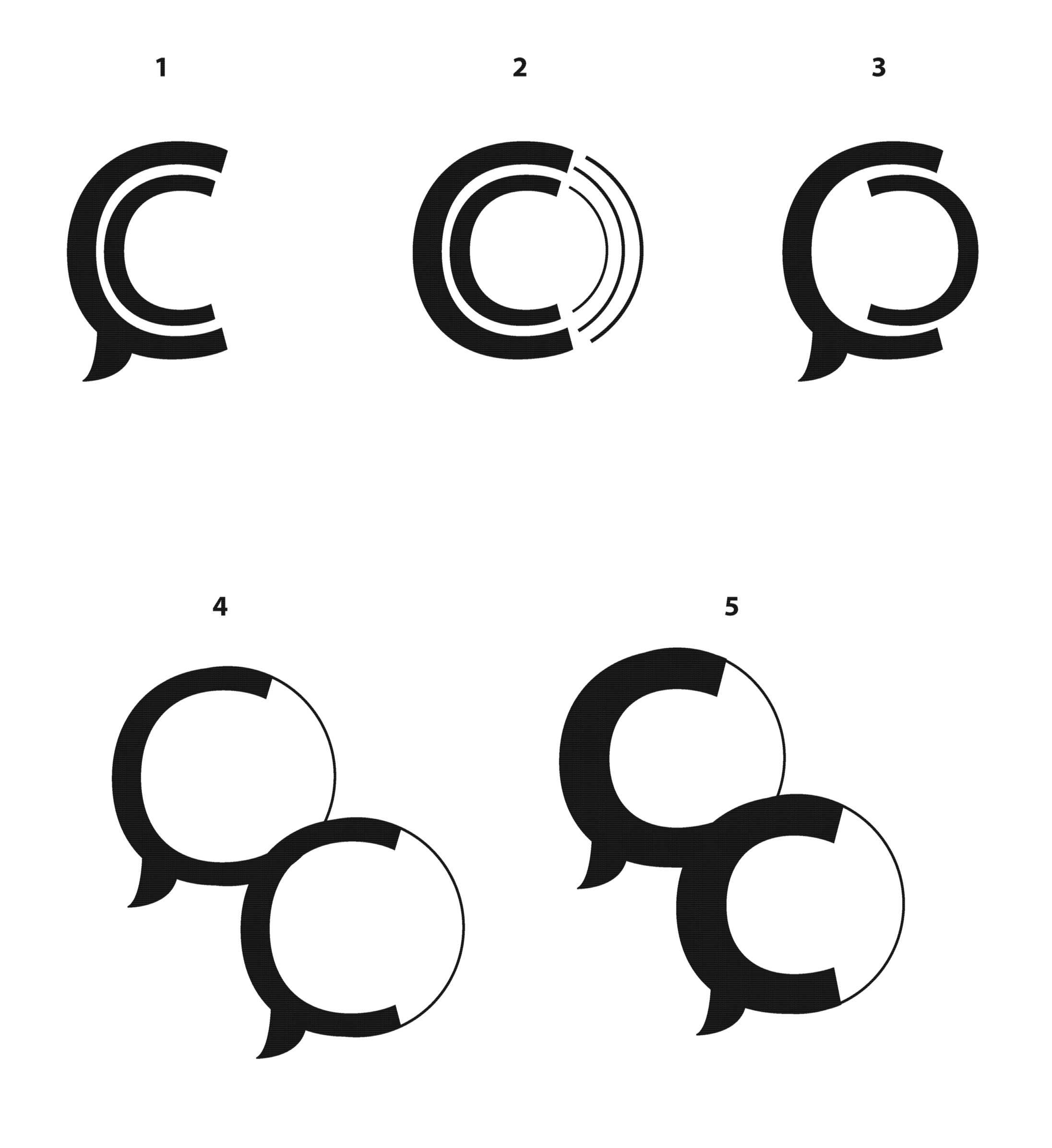
Exploration

color philosophy
Teal evokes calmness and sophistication. The color conveys trustworthiness and balance through its blending of blue and green, making it a great choice for a healthcare company.
Calm
•
Trustworthy
•
Balanced
•
Calm • Trustworthy • Balanced •
brand guidelines
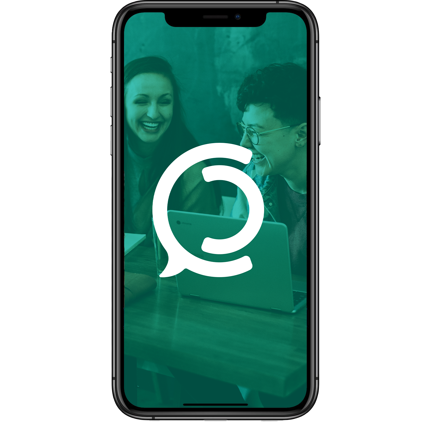
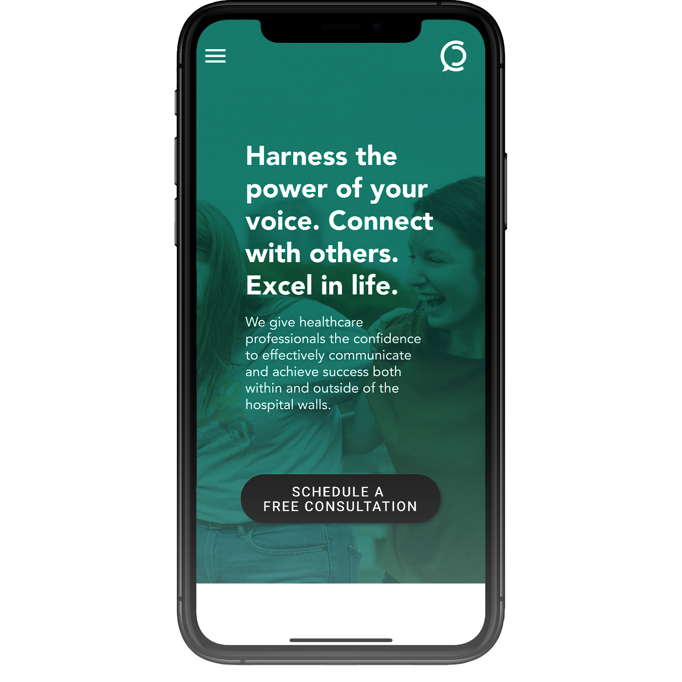
Brand application






Additional work
-
![]()
Artwork
-
![]()
American Electric Power: Brand Videos
-
![]()
JPMORGAN CHASE: SOCIAL MEDIA
-
![]()
American Electric Power: Product Release